A grounded new identity for strategic clarity
A shared vision of change
Made in Finland for humans and grounded in Nordic clarity, Keto helps organizations confidently navigate change with tools that align strategy and execution. While we knew this description was a true representation of Keto, it wasn’t coming across in our branding. The message of our unique culture and the human impact of the platform we built was getting lost.
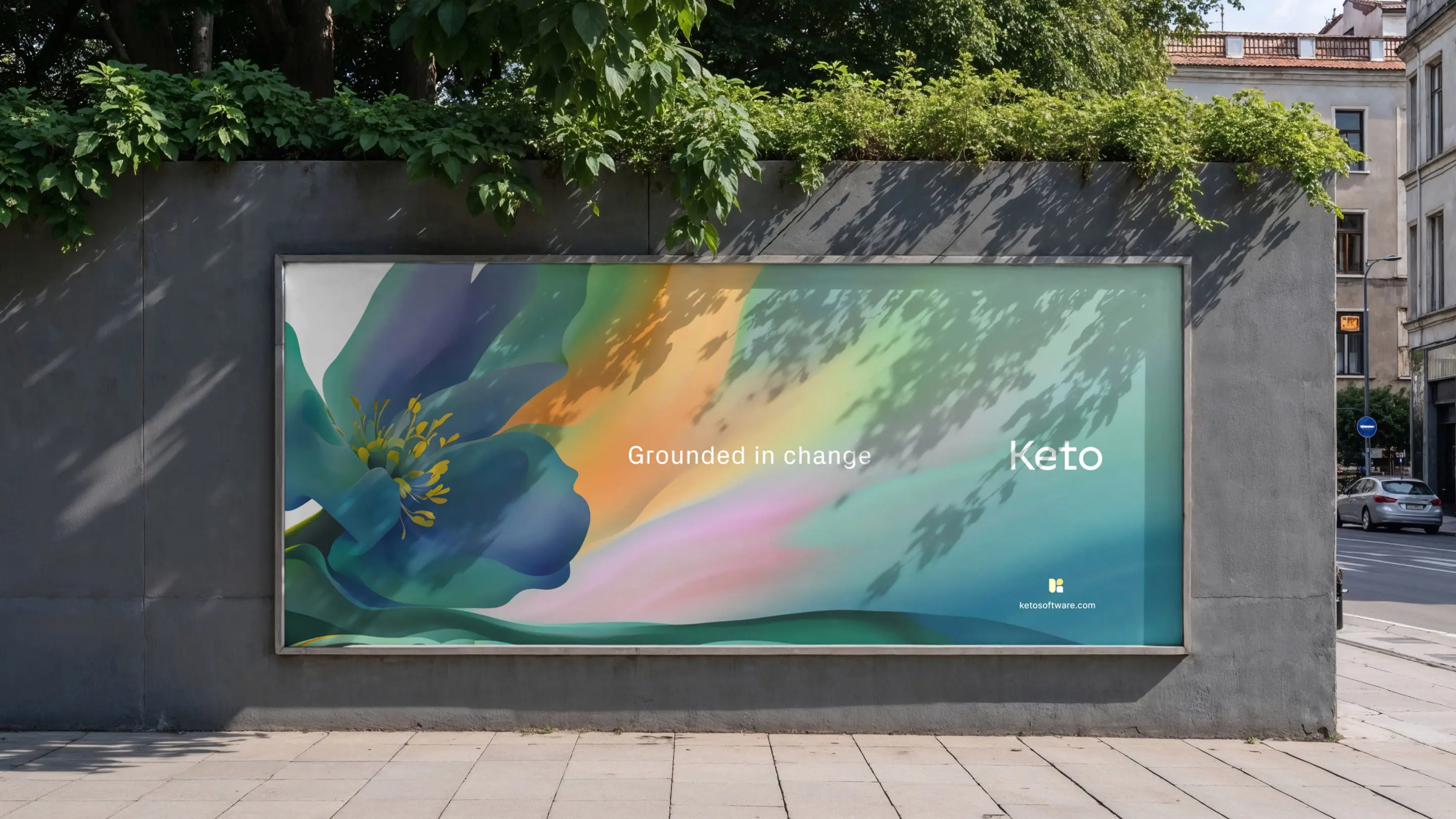
As truly collaborative partners, Mission Creative helped identify those gaps and designed a holistic approach to address them. We developed a new brand identity rooted in our name: “Keto,” which means “meadow” in Finnish. The meadow metaphor speaks to a secure yet dynamic space that promotes exploration and innovation. Calm but alive. Structured but adaptable. Just like our platform.
Flourishing, grounded, human-centric
The new identity includes a refreshed tone of voice, flexible visual system, and design elements that echo both our technical precision and people-first philosophy. From modular “Meadow Shapes” to our distinctive “Bloom” illustrations, every piece of the system is built to support motion, clarity, and growth.
For a platform built to simplify complexity, this new identity gives us the solid ground we need to keep moving forward, while allowing for room to flourish as we grow.
👉 Check out the Mission Creative x Keto Case Study and Get in touch with Mission Creative if you are looking to adapt, grow, and stay ahead through purpose-driven design.